Rethinking the Southwest App
Designed in 2017
Highlights: The Problem, Research, Prototypes, User-Testing, UX & UI Design
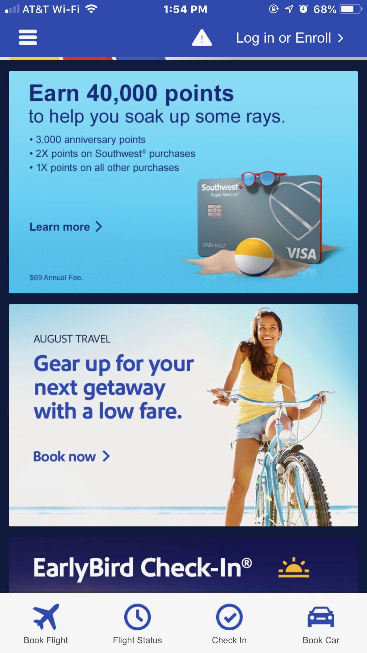
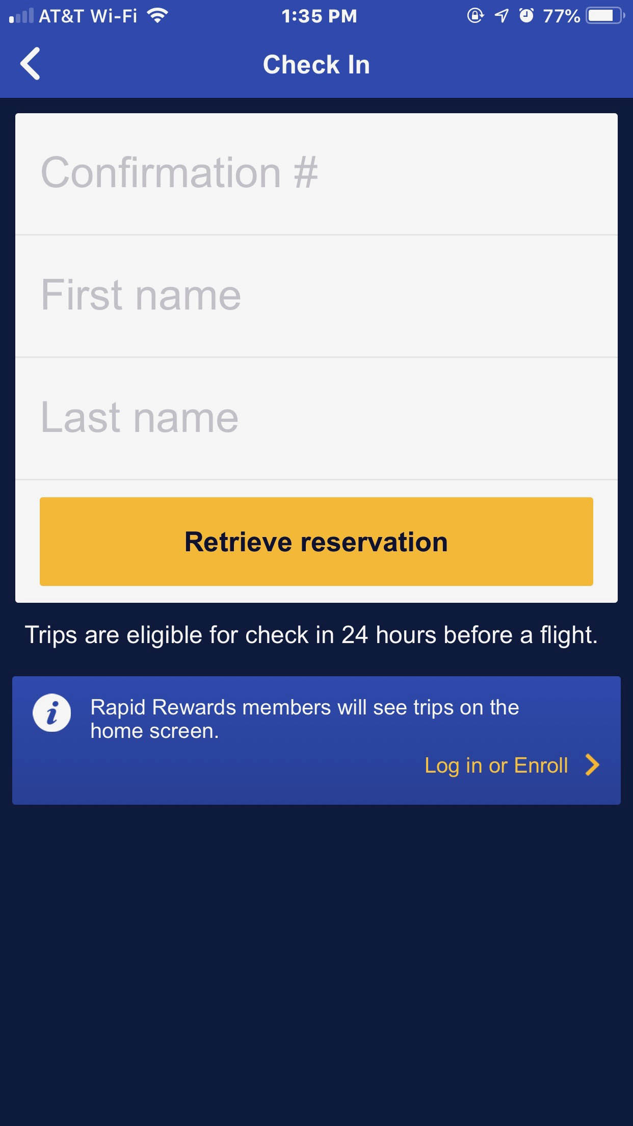
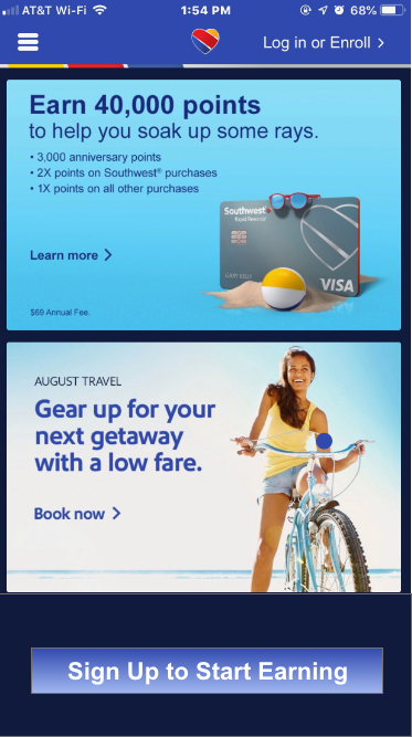
Why redesign the app? The impetus for redesigning Southwest’s app came from my own experiences using the app while traveling. On the first occasion, I checked in online but forgot to print my boarding pass at the hotel. My son and I were late leaving for our drive to the airport so I was hoping we could get a mobile boarding pass. Since I was driving, my 19 year old son downloaded the Southwest app to his phone. He had trouble finding where to login as the screen was confusing with ads and asked for him to login. Since we don’t have a frequent flyer account we were guests. He found the guest option but when he clicked he was still on the home screen. Finally he found a check in icon at the bottom of the screen and clicked. He needed our flight confirmation number. Since I didn’t have that in front of me he needed to look it up in my flight confirmation email. In frustration we gave up and checked in at the airport.
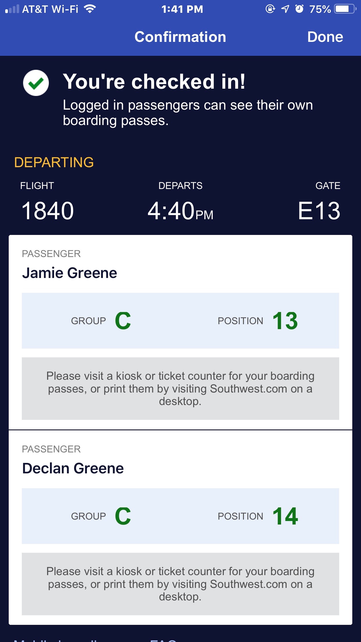
At this point we were very late and we ran to get to terminal C as shown with a big capital letter on the boarding pass. Except C wasn’t the terminal, it was our boarding group. The actual terminal was in much smaller print. Not having my glasses on, I didn’t see the small type. If we had gone to terminal C, we would have missed our flight. Fortunately my son doesn’t wear glasses and could read what the actual was.
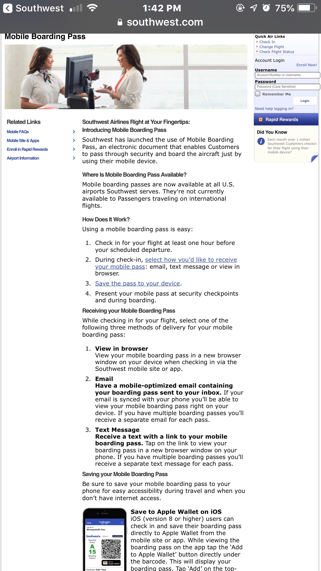
On my second occasion using the app, I checked in with my confirmation number and completed check-in. But, there was no mobile boarding pass, just a message saying I would have to print my boarding pass at the airport. What’s the point of an app if you can’t get a mobile boarding pass? In reading the Mobile Faq’s page, there should have been an option at check-in to select a mobile boarding pass. This option was never shown to me despite checking in three times just to see if the outcome was different. Again, I had to check in at the airport. At least this time we weren’t late!
What users say
I read through the reviews for Southwest’s app and while many were favorable, there was a theme with users who posted poor reviews. Note: All reviews are since the last update to the app.
- “Instead we were directed on the app to go to the kiosk and print them… I wonder why they can’t ge with the times and fix this seemingly simple issue. As a long time customer, and someone with a large family, traveling can be a hassle, so if SWA can make our lives easier by fixing this we ALL would be much appreciative!”
- “Why provide an app for your customes if it is less convenient and not equal to what you can accomplish on the desktop site?”
- “If I’m logged in and click on flight status, I still need to type in a flight number or search by departing airport, etc….I used the app to check in to my flight and still had to ge a boarding pass printed at the counter…It’s a seriously frustrating experience.”
- “Very inconvenient. I’m shocked that mobile boarding passes aren’t available. Wow.”
- “This one is so frustrating to use I basically have gone back to paper…Traveling with kids- I can’t get their boarding passes. It’s not intuitive and easy to use. I really wish it was.”
The Problem
- Inability to obtain a mobile boarding pass when checking in via the app
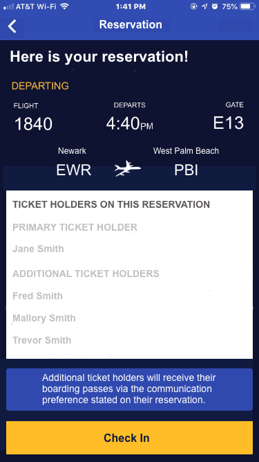
- Inability to obtain a mobile boarding pass when there is more than one person on a reservation
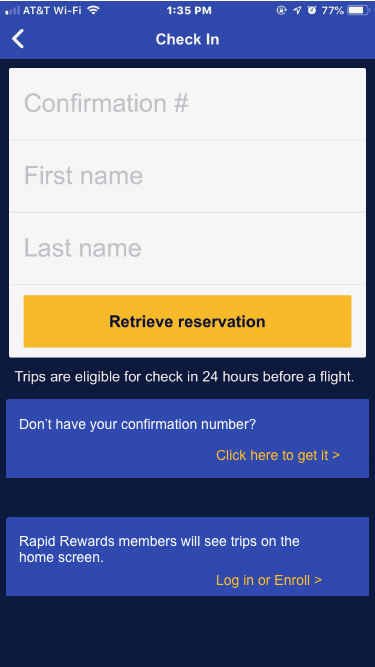
- Unable to check in without a confirmation number
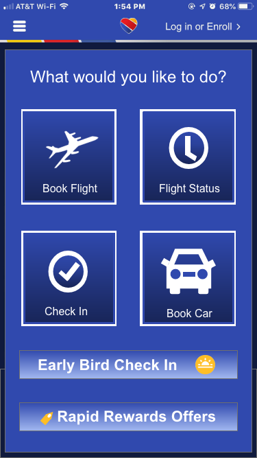
- Busy and confusing home screen
While it does say on the mobile faq’s page that there will be an option shown for how the ticket holde wants to receive their boarding pass, I did not see this and it is apparent that many people had the same experience as I did.
The Solution
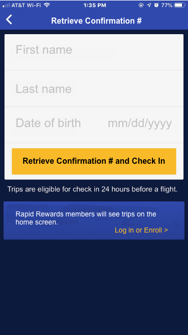
Given that the inability to obtain a mobile boarding pass and difficulty checking in without a confirmation number were common complaints, I decided to focus on improving the process for both.
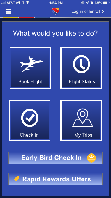
- I simplified the home screen to focus on the most common tasks a user would carry out on the app
- I included an option to retrieve a reservation without a confirmation number
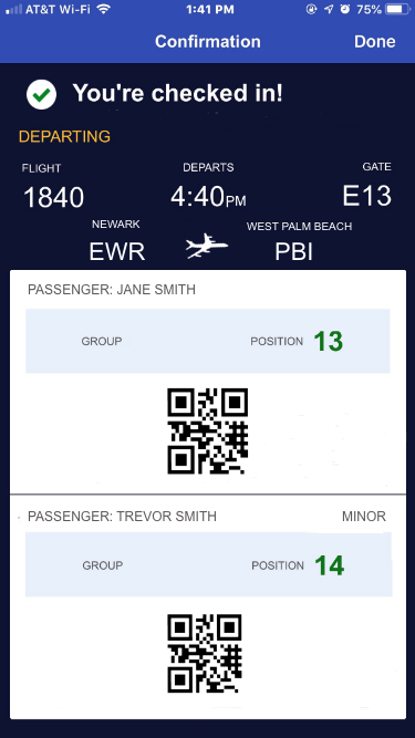
- Each traveler on the reservation will get a boarding pass via either email or text depending on which method they selected at the time the reservation was made.
- Mobile boarding passes for minors would be included with the primary ticket holder’s boarding pass.
Tools Used
- Adobe XD for the prototype
- Adobe Photoshop CC for image editing
View screens and design assets here: https://xd.adobe.com/spec/b4963ee0-ed21-4fcf-7889-3ff754620014-c2a7/
Usability Testing
I had three users test drive the app on usertesting.com. It was interesting for me not just to see how they were able to interact with the app but how the way I explained the tasks affected their experience.
User #1 – was confused by my labeling the task retrieve reservation and not check in. He looked for a retrieve information button or menu item but once he realized there wasn’t one, he clicked on the check-in button. He noticed the early bird check-in button first. He liked the big buttons and that there wasn’t too much information. Said it was very quick to check-in and quicker than some other apps for flights he has used. Very easy to check-in but didn’t think he would have to check in because of retrieve info.
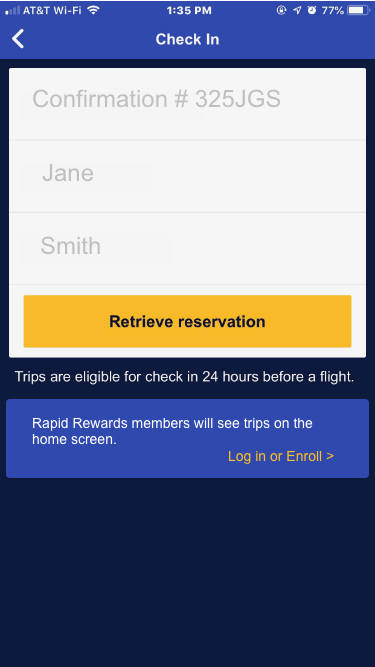
User #2 – Check-in was straight forward. She went right to the check-in button. My instructions were a bit confusing to her but she still found the process easy to understand and was able to complete check in without any problems.
User #3 – First thoughts are she is very busy and wants to check in as quickly as possible. Very simple screen. Thought book car button was out of place and distracting. Didn’t see the need for it. Liked that you only needed confo# and first, last name. Moves along quickly so she could see the info she needs. Exactly what she needed.
Based on user feedback, I changed the home screen by removing the “Book Car” button and replacing it with “My Trips” since it would complement the other button options.
Key learnings
- Communication can either help or confuse a user.
- Simple designs make it easy for users to find what they want and complete a task
- I initially kept the Book Car option because it was one of the four options Southwest used on their apps homescreen and I figured they had a reason for it even though I thought there might be a better option to use there. Don’t assume that what someone else has done is better. Listen to what users have to say.

