Making Troubleshooting Less Troublesome
Verizon Wireless NRB Network Services Support Portal
Highlights: UX Research, Information Architecture, Design Process, Low and High Fidelity designs, UX & UI Design
My Role: Senior UX/UI Designer
7 minute read
TL:DR
- Improved ticket design and workflow lead to productivity increase of 65%
- SUS score increases 45 points
- Ticketing design becomes a model for other ticketing systems
Project Background
I was the sole UX designer responsible for the redesign of the Network Services Support Portal at Verizon Wireless. The portal consisted of several troubleshooting tools used by high level technical support engineers to create tickets and diagnose and solve wireless network problems for retail and enterprise customers.
I was the first UX designer to work on the portal. It had been built by various developer teams who worked in silos. Needless to say, there was no consistency in the UI for the portal.
While business leaders recognized the need for a UX designer, the developers did not. They thought UX designers made things “look pretty” and the portal certainly didn’t need to look pretty. It would take diplomacy on my part, learning about their hesitations, and the assurance that I was not going to ruin their portal.
Discovery
This case study focuses on the redesign of the ticketing system.
Before embarking on the redesign I needed to learn about how the support engineeers used the tools, evaluate the existing tools, and get some baseline quantitative data.
I spent three weeks carrying out an ethnographic study in order to watch and learn how engineers used the various portal tools. In my conversations with them and observations, these were the common frustrations mentioned:
- The engineers felt like they had no say in what was developed and how things worked.
- They were often frustrated by how difficult the tools were to use.
- The tools were especially hard to use for less experienced engineers.
- They had trouble understanding the data they saw.
- They had to swivel to other Verizon applications when working on a support ticket.
As part of the discovery process, I conducted a heuristic analysis of the existing portal to document issues with usability, accessibility, information hierarchy, and UI inconsistencies.
- New features were added in a disorganized fashion which made the UI cluttered and confusing.
- There was no logical page hierarchy.
- The portal was a data intensive tool and the current UI was visually overwhelming.
- There were no design standards for any of the components.
- There was no error handling in the ticket design.
- Page load was often extremely slow.
Finally I sent a System Usability Scale survey to the engineers to get quantitative data on their experience using the existing portal. The SUS results showed an average score of 40 – not good.
It was a complex sytem that was cumbersome to use and caused long wait times for customers to have their wireless problem solved.
Armed with a wealth of feedback, I presented my findings to senior leadership. While I was confident the portal had alot of potential, I emphasized what was wrong with the portal while neglecting what was good about it. This did not go over well with leadership. Hence, I have learned to always lead with the positive before discussing the negative.
The Ticketing System
The ticketing system was a vital tool in the portal since it enabled engineers to create, solve, and close tickets. It was the main job to be done.
Since I had never designed a ticketing system before, I knew collaboration and feedback were going to be very important throughout the process. I met with senior management for Network Services as well as the Product Owners in order to understand the business goals and requirements of the project. They were:
- Reduce the amount of time engineers spent solving customer problems
- Reduce the amount of time engineers spent creating tickets
- Reduce the complexity
- Better grouping of related tickets
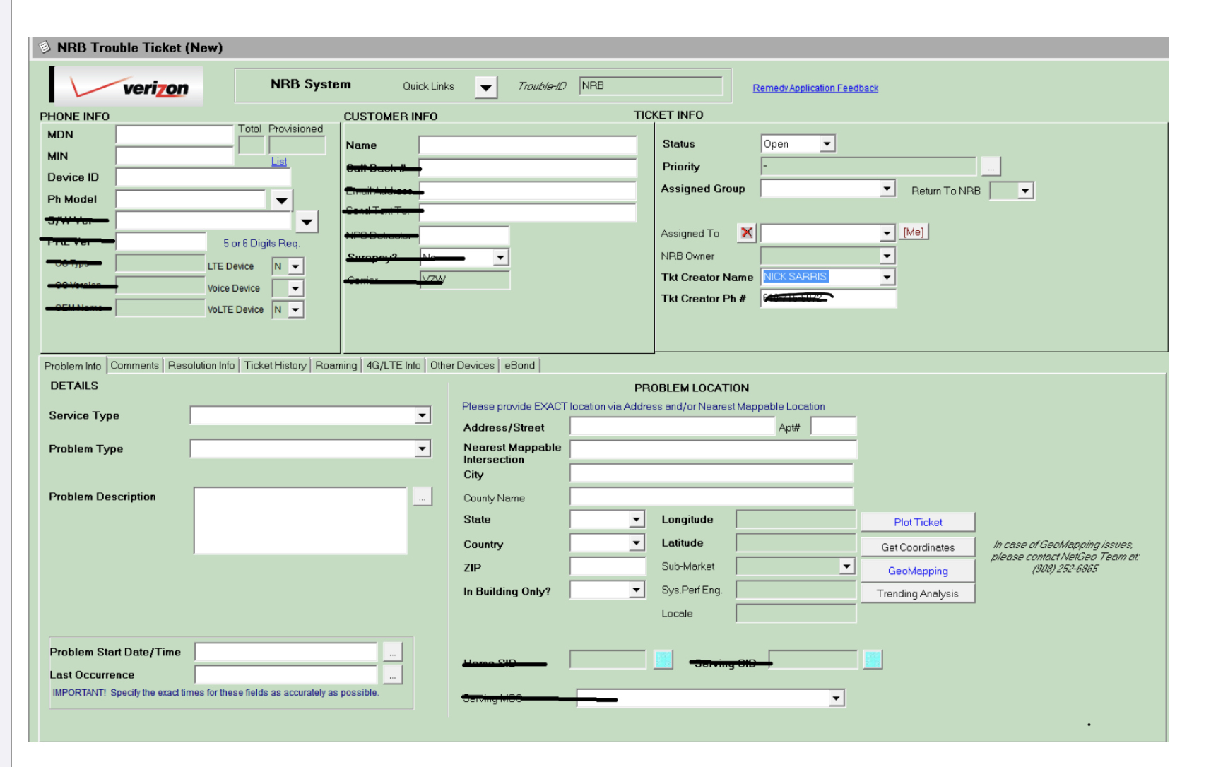
This is a screenshot from the original ticket system. There were a number of common frustrations expressed by engineers:
-
- It was antiquated and clunky
- There was a large amount of documentation required for each ticket forcing users to sometimes copy/paste information from several sources.
- The layout had many tabbed sections, sub-tabs, and sub-tabs of tabs making it difficult for engineers to find what they needed.
- Engineers didn’t know when they had made an error until they clicked to submit the ticket. They received an error message that didn’t say what the error was. This meant having to go through the entire ticket to figure out where the mistake was.
- It was very difficult to group related tickets.
- Some of the dropdowns contained hundreds of menu items with no hierarchy and no way to filter. Users had to drag a scrollbar to view all of the menu items.
- If an engineer needed to make an edit to an existing ticket it was very time consuming for them and there were many times where they wound up deleting the ticket and recreating it.
Design Process – A Group Effort
My UX design process is always focused on human – centered-design. What better way to practice this than to involve the technical support engineers in the design of the new ticketing system? They were eager to participate and felt like their voices were going to be heard for the first time.
The engineers were excited at the prospect of having a ticketing system that was made and worked for them. I facilitated several focus group calls and workshops. I split the groups by experience level so all voices would be heard.
The more experienced engineers made it clear that they did not want a tool that was “dumbed-down” so I made sure to balance the needs of both experienced and less experienced users.
Taking what I learned from the engineers and continued discussions with the Product Owners and business stakeholders, we developed the UX strategy and project roadmap.
These were some of the new features:
- Use of pre-populated fields wherever it was possible.
- Give engineers a high level snapshot of customer and problem information.
- Design a dashboard where engineers could see how many tickets they were assigned, pending tickets, and notifications.
- Visualization of tickets they completed, assigned tickets, and a meter to track their monthly progress.
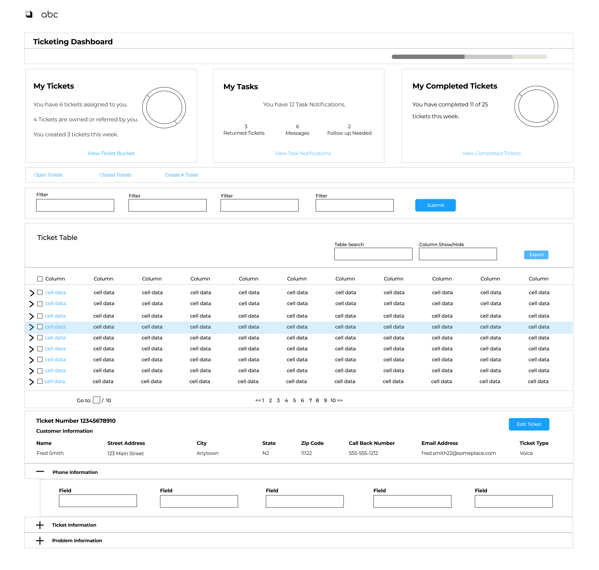
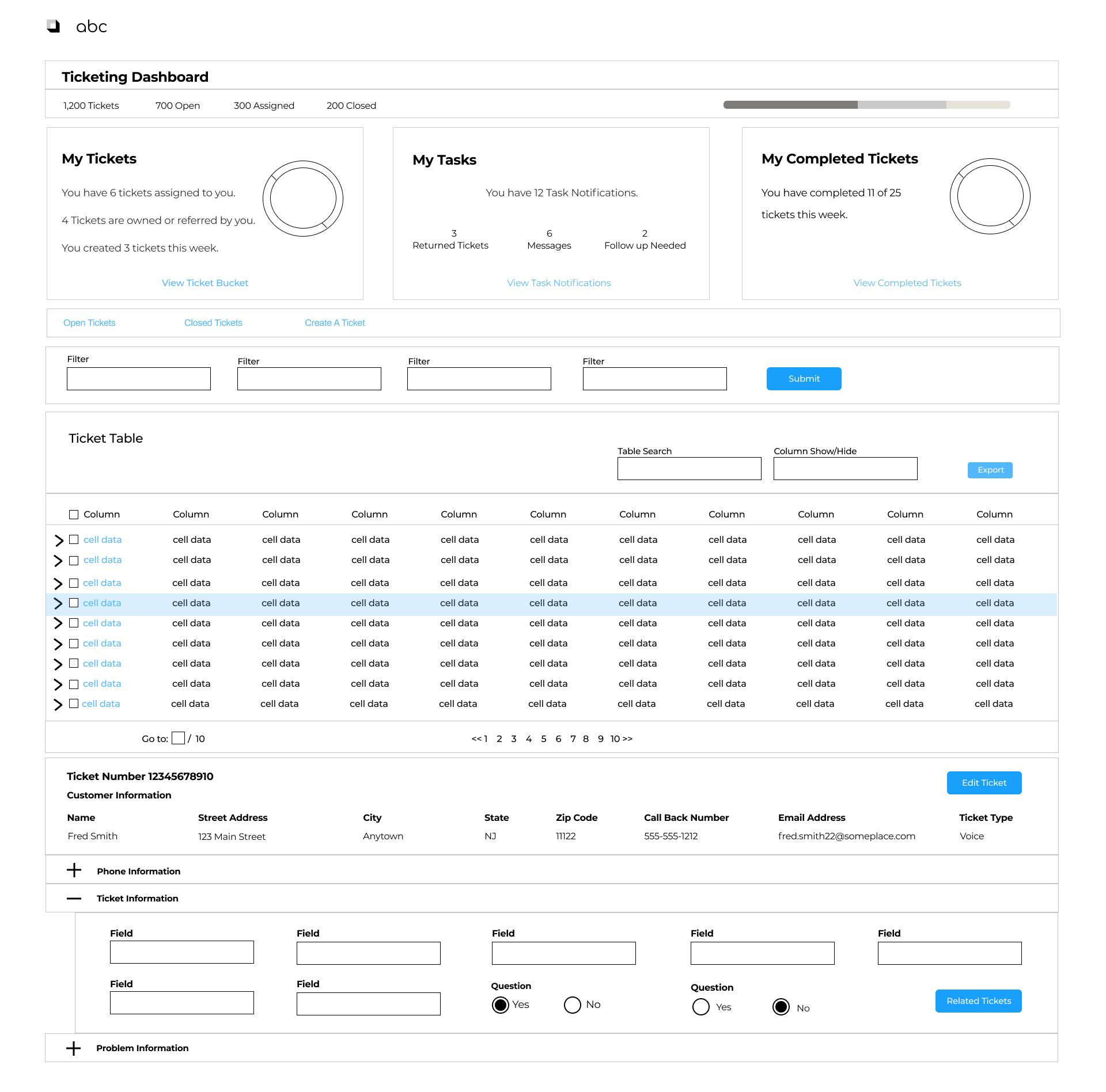
- Fields were related and grouped together into expandable sections. Engineers could click to see one or more sections depending on what they were working on. Everyone loved this concept. It was something they hadn’t seen before.
- Relating child tickets to a parent was simplified.
- Filters were added to narrow the focus of their ticket search.
- Dropdowns would use predictive text which lessened the need to scroll through hundreds of menu items.
- Editing tickets would be streamlined to enable only those fields that could be edited.
- Add an admin area for user access requests, and managing input fields.
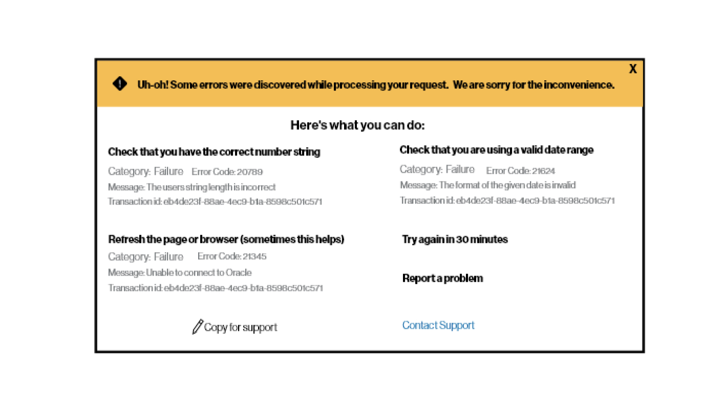
- Error messaging that informed and gave guidance for how to fix them.
Cross Team Collaboration
None of the improvements to the support portal could have happened without the collaboration of business stakeholders, Product Owners, developers, engineers, and myself.
The weekly and sometimes daily calls and design reviews I had with Product Owners and developers helped me to stay in alignment with what the business goals were as well as giving me the ability to evangelize them to the benefits and value of human-centered-design.
Where we collaborated:
- Initial low-fidelity wireframes were shown to the product team, developers, and users to get initial feedback.
- Iteration of the designs based on user feedback.
- QA’d with developers and on the designs and staging environment that was created for usability testing.
- User interviews and usability testing with each user group.
- When there was a technical blocker I worked with the developers to find an alternative.
From the several focus group sessions with the engineers and usability testing of the initial designs, these were the features that I recommended become part of the new ticketing system.
- Use of pre-populated fields wherever it was possible.
- Give engineers a high level snapshot of customer and problem information.
- Design a dashboard where engineers could see how many tickets they were assigned, pending tickets, and notifications.
- Visualization of tickets they completed, assigned tickets, and a meter to track their monthly progress.
- Related fields grouped together into expandable sections. Engineers could click to see one or more sections depending on what they were working on. Everyone loved this concept. It was something they hadn’t seen before.
- Relating child tickets to a parent was simplified.
- Add filters to narrow the focus of their ticket search.
- Use predictive text for dropdowns which lessened the need to scroll through hundreds of menu items.
- Streamline editing tickets to enable only those fields that could be edited.
- An admin area for user access requests, and managing input fields.
- Error messaging that informed and gave guidance for how to fix them.
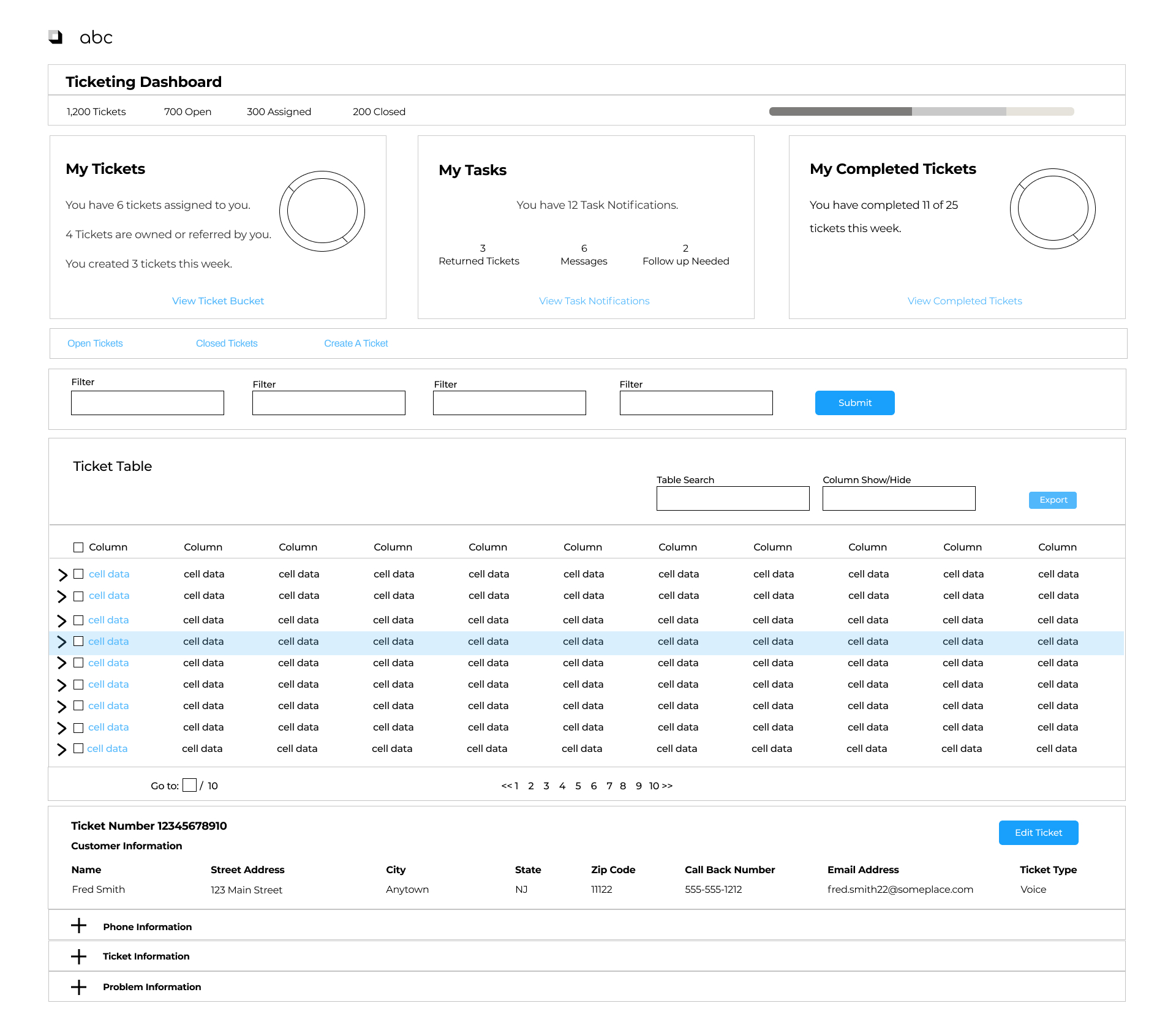
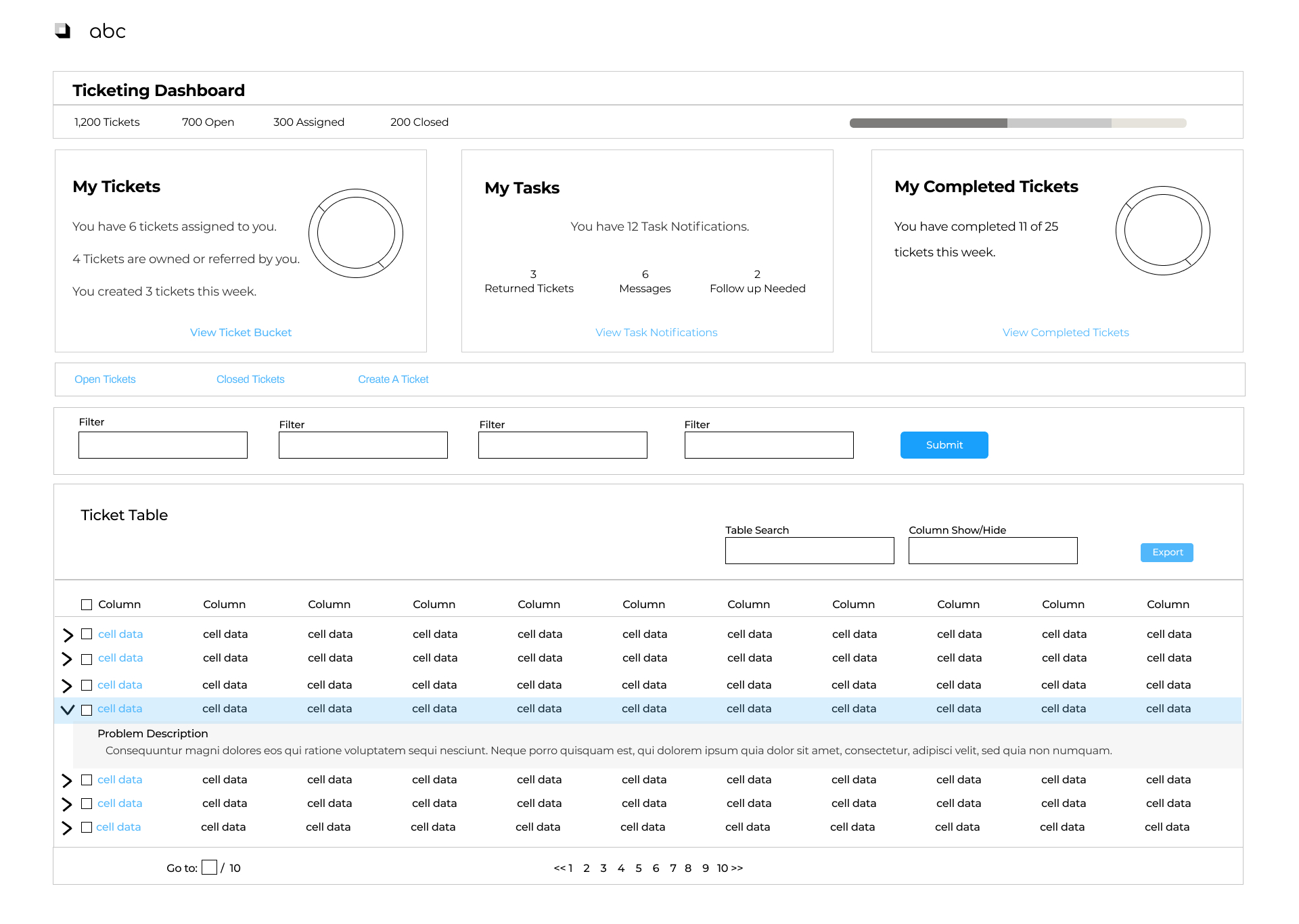
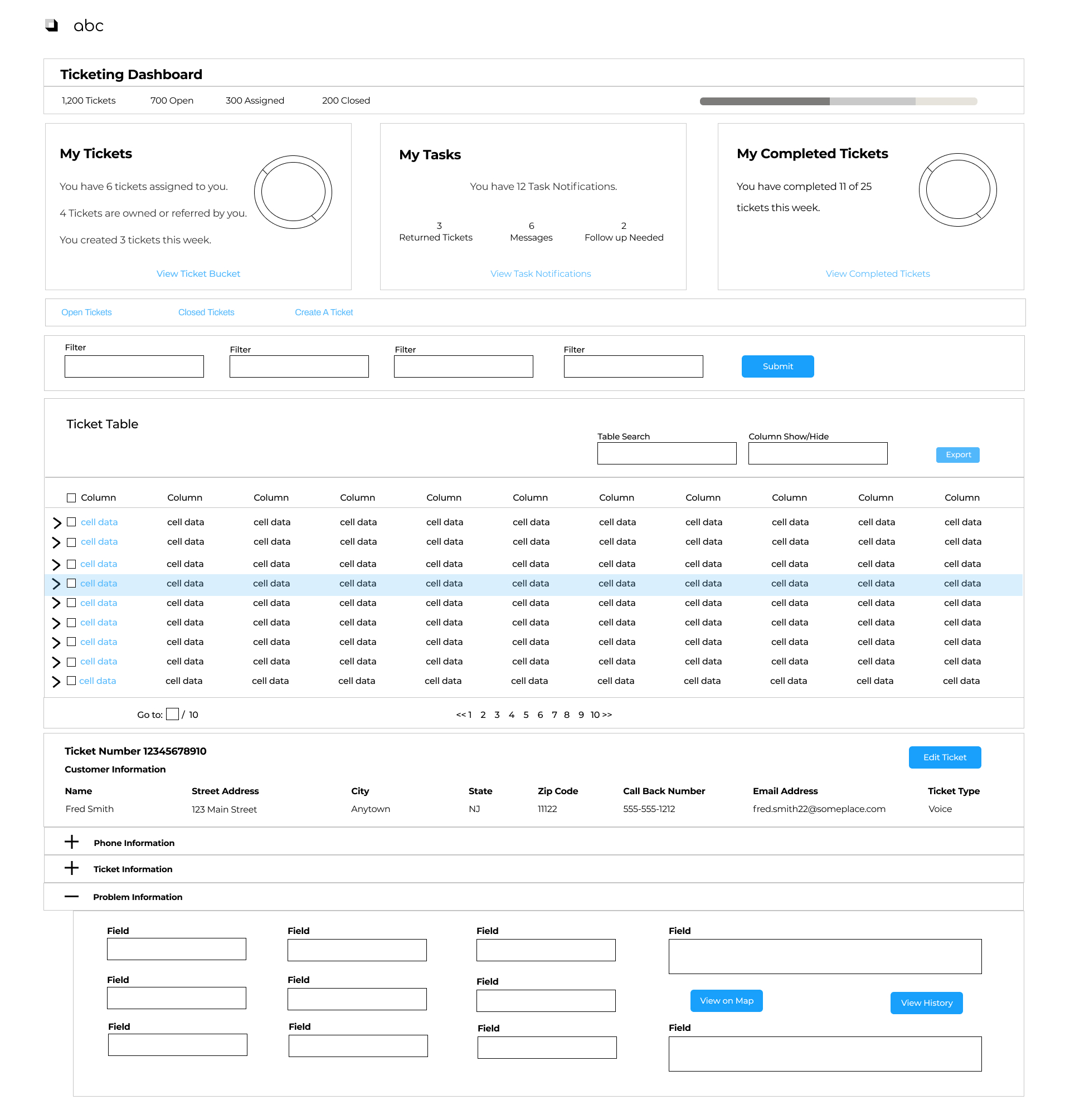
Based on my recommendations, below are initial low-fidelity designs for the ticketing dashboard.
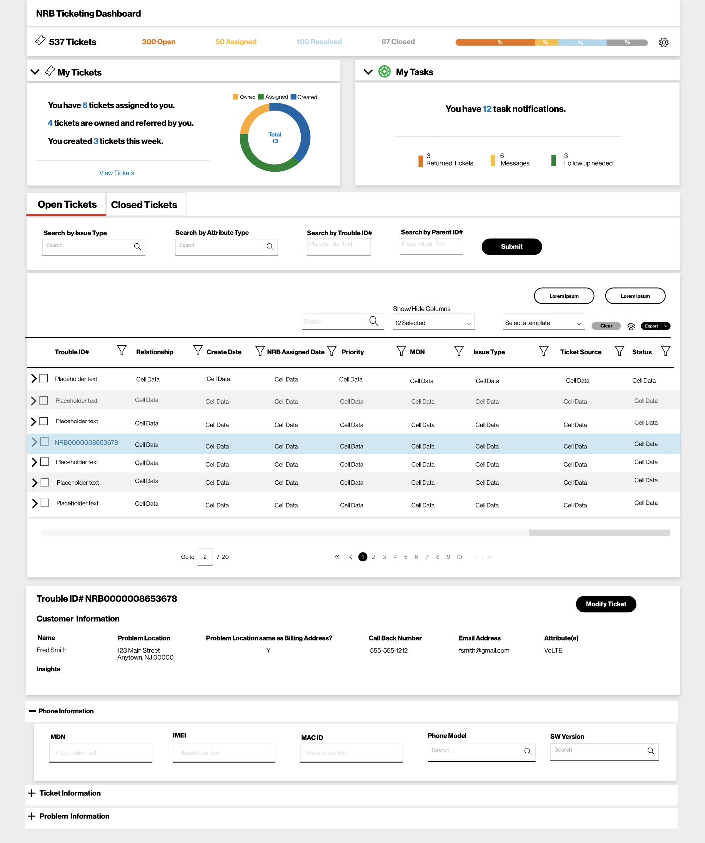
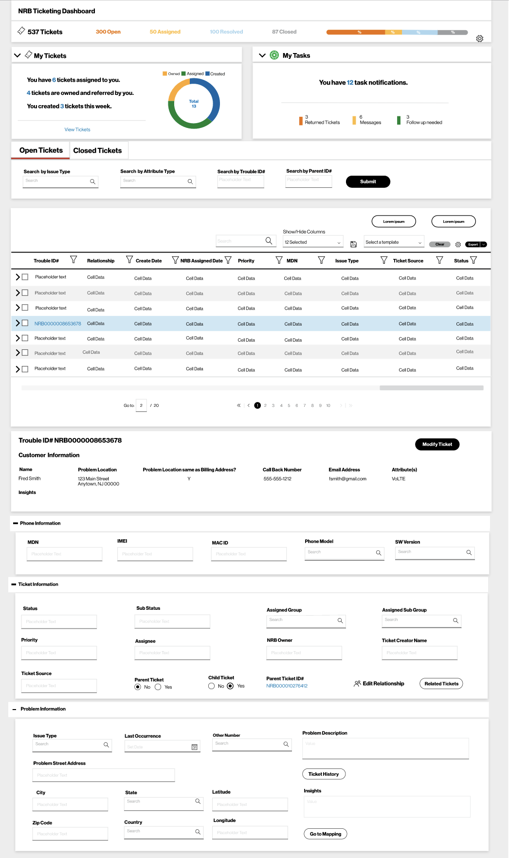
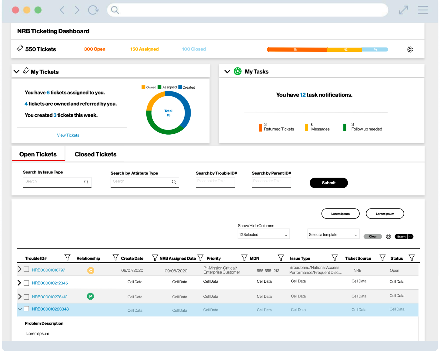
Below are high-fidelity designs.
I made use of expandable rows because I like the flexibility they give users.
- They give a high level view of the data (rows closed).
- Users can select one or more sections to expand depending on what task they are working on.
- Users may prefer to see all data at once or limit what they see.
- It helps users to stay focused on the task they are working on without being distracted by other data that may not be relevant at the time.
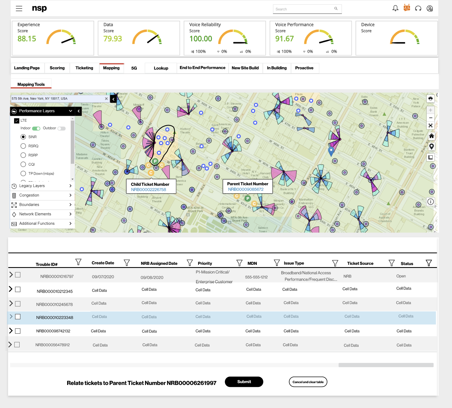
This is a concept I designed for relating tickets. Users could draw a circle arount the orphan tickets (one or more tickets located close to a parent ticket but not grouped with the parent). Once the orphan tickets were selected, the user just needed to click the submit button and the new child tickets would populate the dashboard.
Design Impact
Usability testing was conducted after the staging environment was complete. Using time on task, the length of time to create and submit a ticket decreased 65%. I created a post launch System Usability Scale survey to compare with the initial SUS survey. The average SUS score increased to 85 compared to 40 from the initial survey. The engineers were able to solve and create tickets faster and there were less errors, enhancing productivity and job satisfaction.
Due to the amount of positive feedback received from both users and NRB leadership, the new ticketing system became the model for other ticketing systems in NRB.
While it was sometimes a challenge to be the only creative in a group of eighty technical engineers, over time, they saw how human-centered design improved their productivity and happiness.
Closing Thoughts
This project was one of the most rewarding ones I have worked on. I knew very little about how wireless networking functioned but, between the time I spent listening to users and working alongside Product Owners, I was able to grasp a good understanding of it. Every day there was a new puzzle to be solved which I greatly enjoyed.
I appreciated the amount of autonomy I was given while also getting to collaborate across business groups. I liked that I could be involved in the entire software development process. I gained a better understanding of the complexities of the development process and how to work with limitations. I enjoyed listening to users and then brainstorming with Product Owners to find solutions to their problems.
It was very gratifying to know that I had made someone’s workday a little easier, less frustrating, and enabling a customer’s ticket to be solved faster while also meeting the business’s goals. That my design for the ticketing system became the standard for similar systems was the icing on the cake!
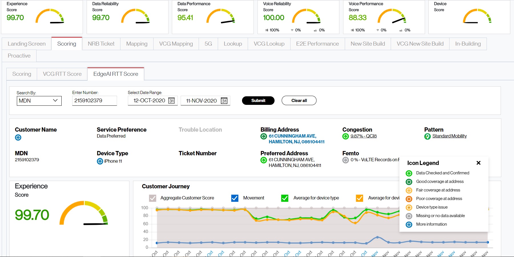
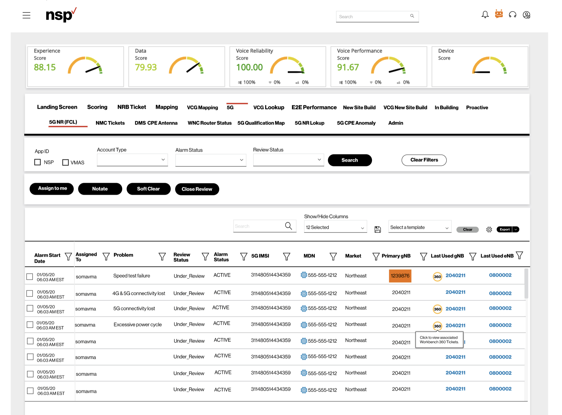
Below are a few designs I created for other tools in the support portal.
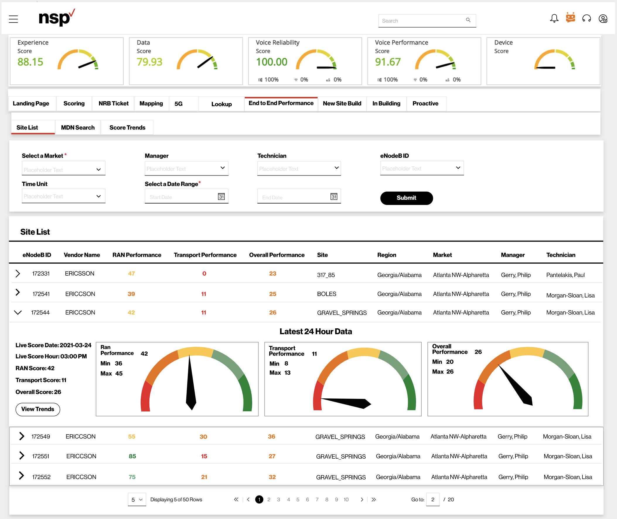
End to End Performance was a highly technical tool in the portal that was used by the most experienced engineers.
- The expanded rows control how much data is visible and gives the user the choice of what they want to see.
- Gauges give a clear indication whether performance is good or bad.
- The colored numbers mirror the colored bands of the gauges.
