How I got the Global Product Team to Embrace User Centered Design
Johnson & Johnson aCREW Purchase Order Application
My Role – Lead Product Experience Designer
7 minute read
TL:DR
-
- Evaluate and improve the user experience and usability, of the aCREW global finance application
- User interviews and workshops
- UX Strategy
- Cross team collaboration
- Establishing a benchmark for satisfaction
Project Background – What happens when you don’t talk to your users
This case study chronicles my journey revamping the user experience of aCREW, a purchase order management application used by Johnson & Johnson employees worldwide.
My initial goals were:
- Learn from the product team and global stakeholders what the product vision and intended roadmap were
- Carry out a heuristic evaluation of the existing application to identify issues with user experience and usability
- Perform moderated interviews with aCREW users including usability testing
- Facilitate workshops with various user groups to understand how they used aCREW
- Define the UX strategy for solving user problems
In the process, I uncovered issues with usability and user experience. Some key findings:
-
- Inconsistent UI, nomenclature, and information architecture hampered usability across aCREW
- Lack of user insights meant the product team didn’t know if the features they developed solved the right user problems
- The design approach was feature-driven, not user-driven. In several instances, members of the product team didn’t know how employees used aCREW or whether a feature was needed but thought it was a “good idea” to have.
Initially, the product and developer leads didn’t see the value of user research because they felt it would slow the release train down. They didn’t know what user-centered-design was and how it could make aCREW a better product. Fortunately, my UX Manager helped me get buy-in from the Global Product Manager and I was off and running.
User Research – Learning by Listening
Before I could design any improvements, I needed to learn what problems I needed to solve.
-
- I conducted in-depth interviews with product stakeholders to comprehend business goals.
- I carried out user interviews with employees from eeach user group to understand pain points, user journeys, and mental models.
- I held workshops with the different aCREW user groups to brainstorm ideas for improving their experience.
- I held workshops with product leaders to discuss UX strategy and roadmap planning.
- Since there was no quantitfiable data for user satisfaction, I implemented a UMUX Lite and NPS survey to benchmark and measure user satisfaction and perceptions of aCREW.
Key Research Findings:
-
- While product satisfaction was low, all users agreed aCREW was better than the manual spreadsheets they had been using before.
- Non-finance users often didn’t understand what the finance and accounting terms meant.
- Finance users felt that aCREW was easy to use but, was not useful for them as it didn’t solve their particular problems.
- Most users couldn’t find or didn’t know what a lot of the functionality was.
Based on what I learned and the guidance of my UX Manager, I collaborated with Global product leaders to design the UX strategy. The strategy included:
-
- Aligning on a plan that solved the correct user problems while also achieving stakeholder goals
- Creating designs that showed what the ideal user experience could look like
- Prioritizing user stories to ensure the most impactful features were addressed first
- Establishing a benchmark for user satisfaction
- Make user research a part of the product release train
Design Iteration & Usability Testing:
I used an iterative design process with a design, test, and learn cadence to ensure we were meeting user needs.
-
- Created low-fidelity wireframes to establish information architecture that aligned with user mental models
- Developed an initial clickable prototype for user testing, and product team feedback
- Optimize user experience based on feedback.
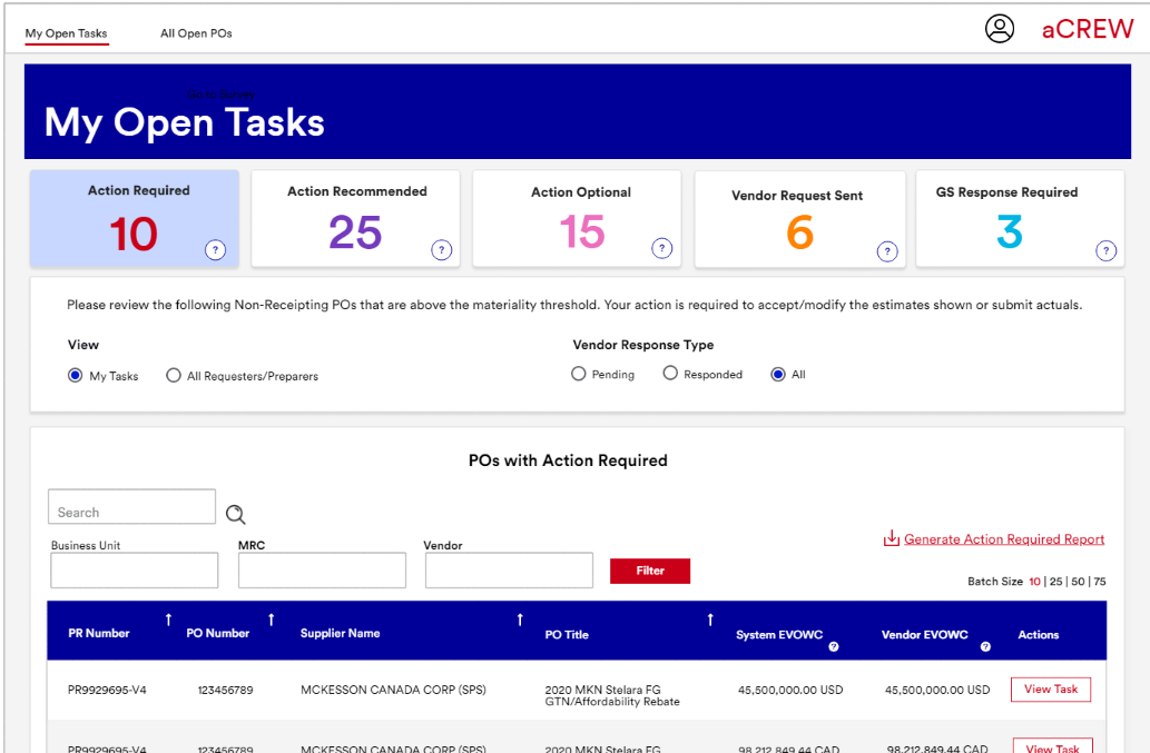
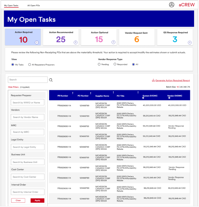
This was the existing UI for purchase order accrual management – My Open Tasks.
Heuristic evaluation of the existing UI revealed these issues:
- Confusing Purchase Order nomenclature with difficult to understand tooltips
- Overuse of the color red which could cause issues for certain color-blind people
- Navigation tabs have very little contrast making it difficult to know which tab is open.
- Confusing button styling and not enough contrast with disable state
- Too many filters and no hierarchy (not all filters are shown)
- Inconsistent layout
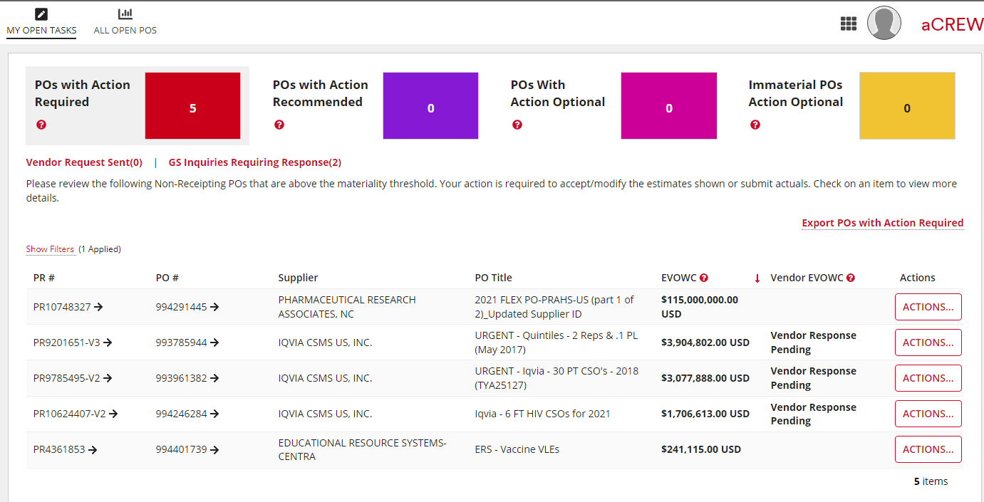
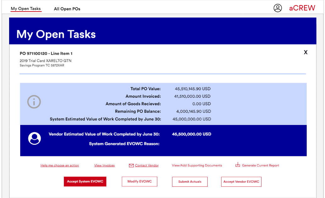
Design improvements:
- PO action nomenclature and tooltips simplified
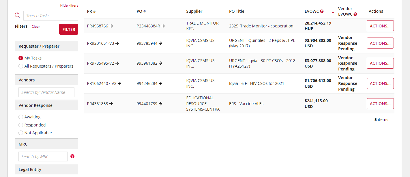
- Option to view all open tasks or user assigned tasks
- New filter hierarchy and removal of filters that weren’t being used
- Purchase order amounts are right aligned for readability
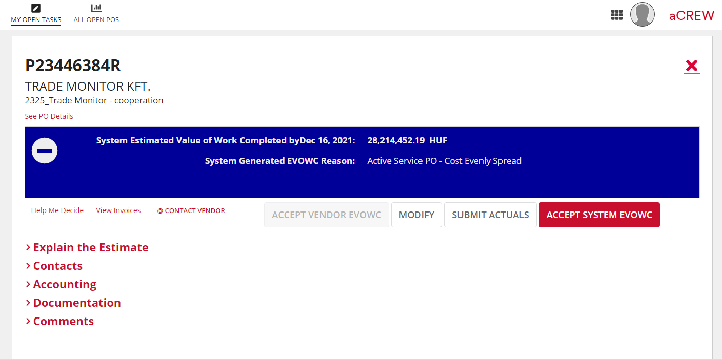
- Buttons clearly show which is the primary action.
- Design incorporates J&J branding colors (red links and buttons are design system components)
A new addition
Based on user feedback, I believed adding a homepage would solve several problems users were experiencing. Both users and the product team were enthusiastic about the idea. Using design, test, and learn the homepage design went through several iterations.
While I had some novel ideas for how to better communicate notifications and important tasks, due to developer bandwidth and a crowded backlog, I scaled back the design to only use the content and data that was readily available in aCREW.
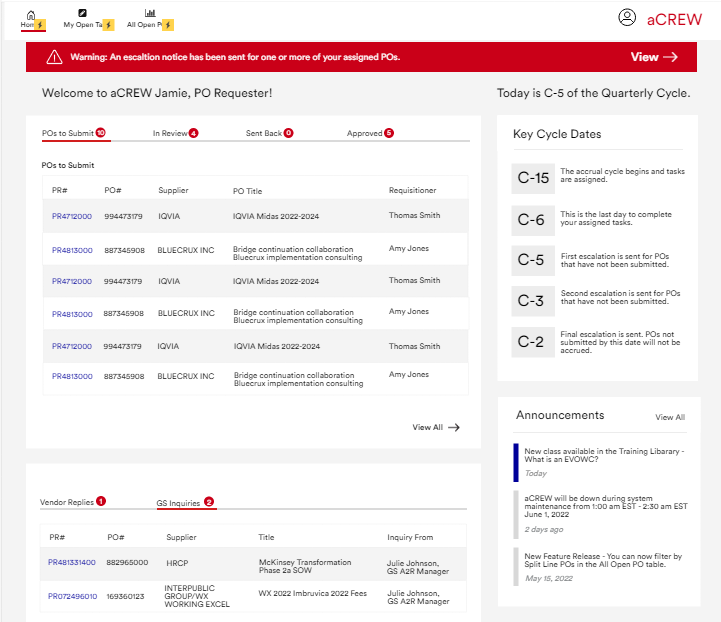
Below is a screenshot of one of the designs.
The addition of a homepage for aCREW solves these user problems:
- Uncertainty of what tasks were assigned to them, what the process was for submitting PO’s, and the status of their PO’s
- Not knowing what day in the accrual cycle aCREW was in or what the different cycle dates meant (these are crucial dates used in financial reporting)
- Not knowing what PO’s were being escalated and what day the esclations would be sent
- No contact information to get help
- Certain user groups lacked financial accumen and found the terminology difficult to understand.
The new homepage helps users in the following ways:
- Users can see what tasks they have and what the status for each is
- A warning banner alerts the user if they missed an important date
- Key accrual cycle dates are shown and explained
- An annoncement section with relevant information
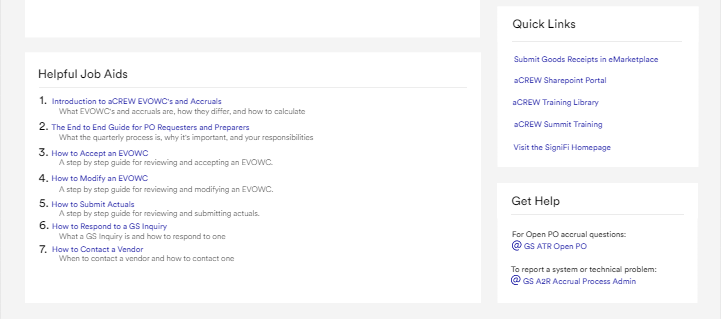
- Links to training materials and other visited sites
- Job aid articles ordered by popularity
- Who to contact for help
Cross Team Collaboration & User Advocacy:
While I enjoy the autonomy of being the sole UX Designer on a project, product design is a team sport and I was proactive in working with the product team, developers, and users.
-
- Held workshops with the Global Product Team and developers to create the roadmap and prioritize work
- Employed a dual track agile proces ensuring developers and UX designers worked in tandem to translate user research into actionable design solutions including QA of the work the developers did
- Presented research findings and design solutions that championed the user’s voice
Roadblocks and Maintaining Focus
The biggest roadblock to the project was availability and budget.
Addressing Roadblocks
-
- Mitigated limited developer bandwidth by focusing on user stories with the highest user impact and lowest development effort
- Maintained user advocacy through regular progress updates and showcasing user research findings to keep stakeholders invested in the user-centered approach
- Adapted project timelines with flexibility, prioritizing user-centric features while acknowledging resource limitations
At times l felt like I wasn’t delivering results for our users because of the delays. It meant focusing on what stories were most important, being flexible with schedules, and continuing to drive the process forward albeit slower than I would have liked.
Impact
Unfortunately the project was canceled due to budget constraints and an announced spinoff of Johnson & Johnson into two companies so I wasn’t able to see my designs come to fruition but, I was able to drive change for the betterment of the users of aCREW and business stakeholders.
- A benchmark for user satisfaction via NPS and UMUX-Lite surveys
- The Product team embraced user-centered-design principles for future development, ensuring a continued focus on user needs.
- Established a solid foundation for ongoing UX improvements through iterative design cycles that continually optimize the experience
- Users feel their concerns are being listened to and will be addressed
- Collaboration across teams and users takes place on a regular cadence. This has helped to foster a shared user and product vision.
This project exemplifies how user-centered-design, when implemented effectively, can transform a product to better serve its users by prioritizing user research, solving the right problems, and continuously iteratating.
I was able to show the product team and developers the value of user-centered-design and how employing it can increase user productivity and satisfaction.
