Physician Compensation Solution
These prototypes were developed as part of a short term project I was on. The goals of the project were to:
- Reduce cognitive load through a simpler workflow
- A cleaner, more modern design
- New color scheme
User satisfaction was low but, without access to users to find out what they were unsatisfied with, we were missing valuable information that could have guided the design team to a better outcome.
Existing layout
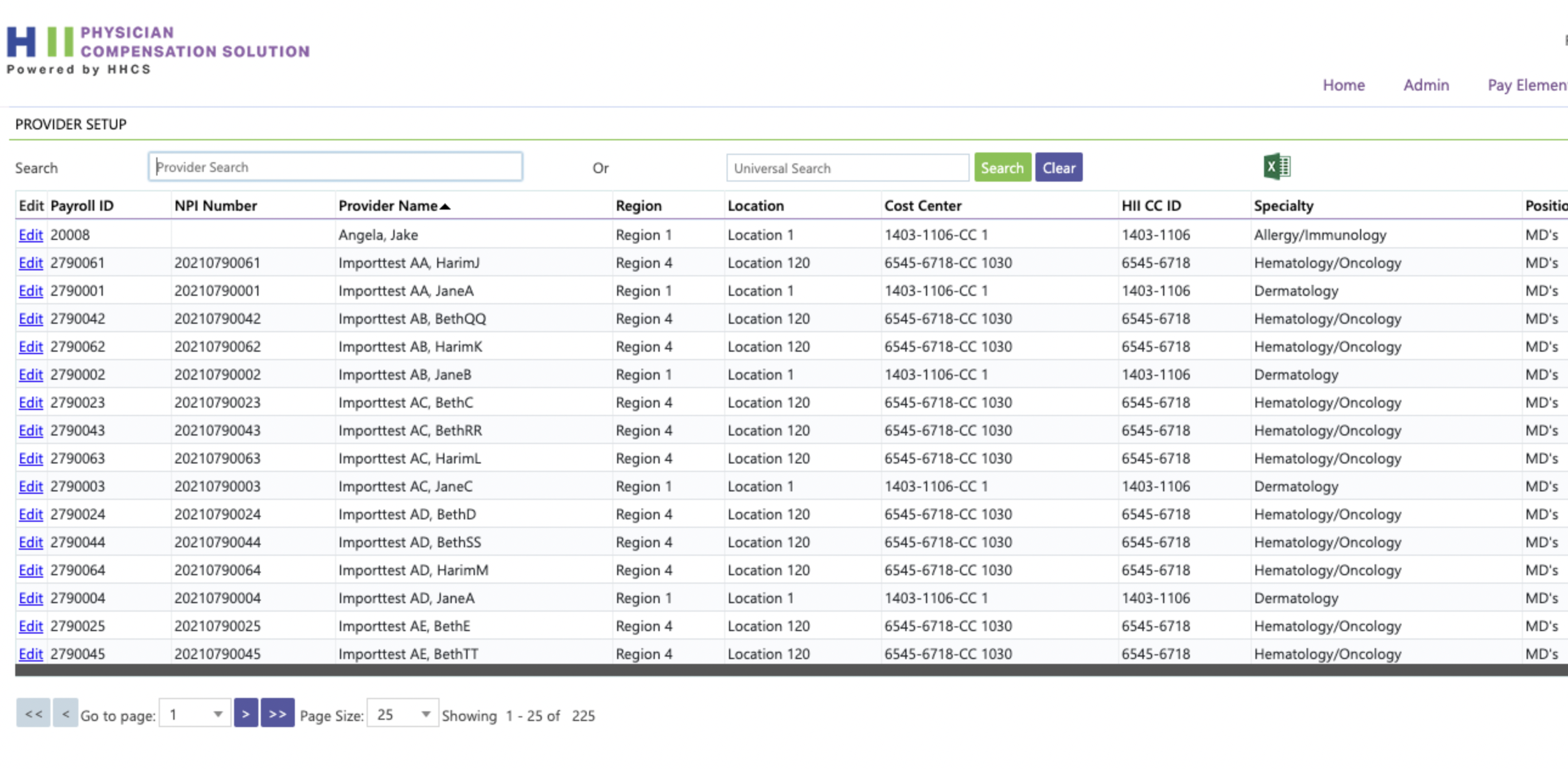
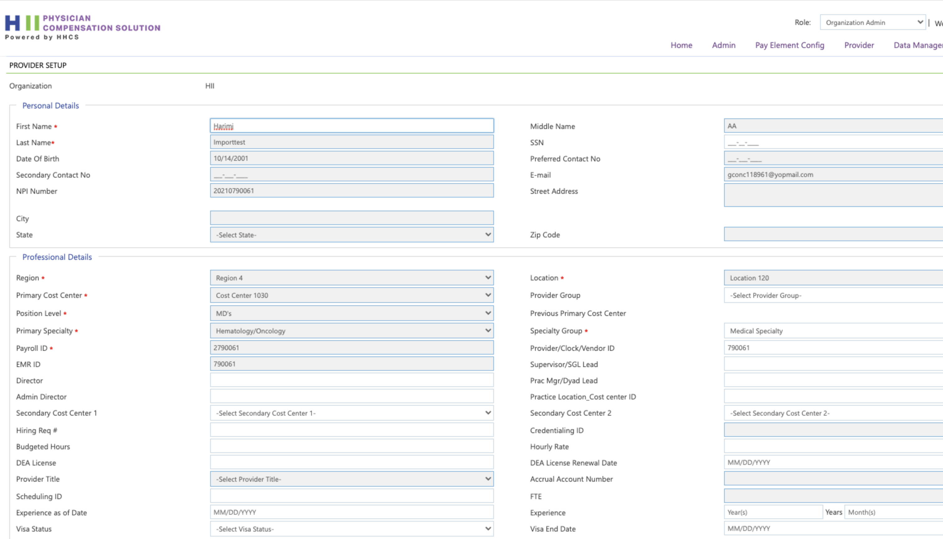
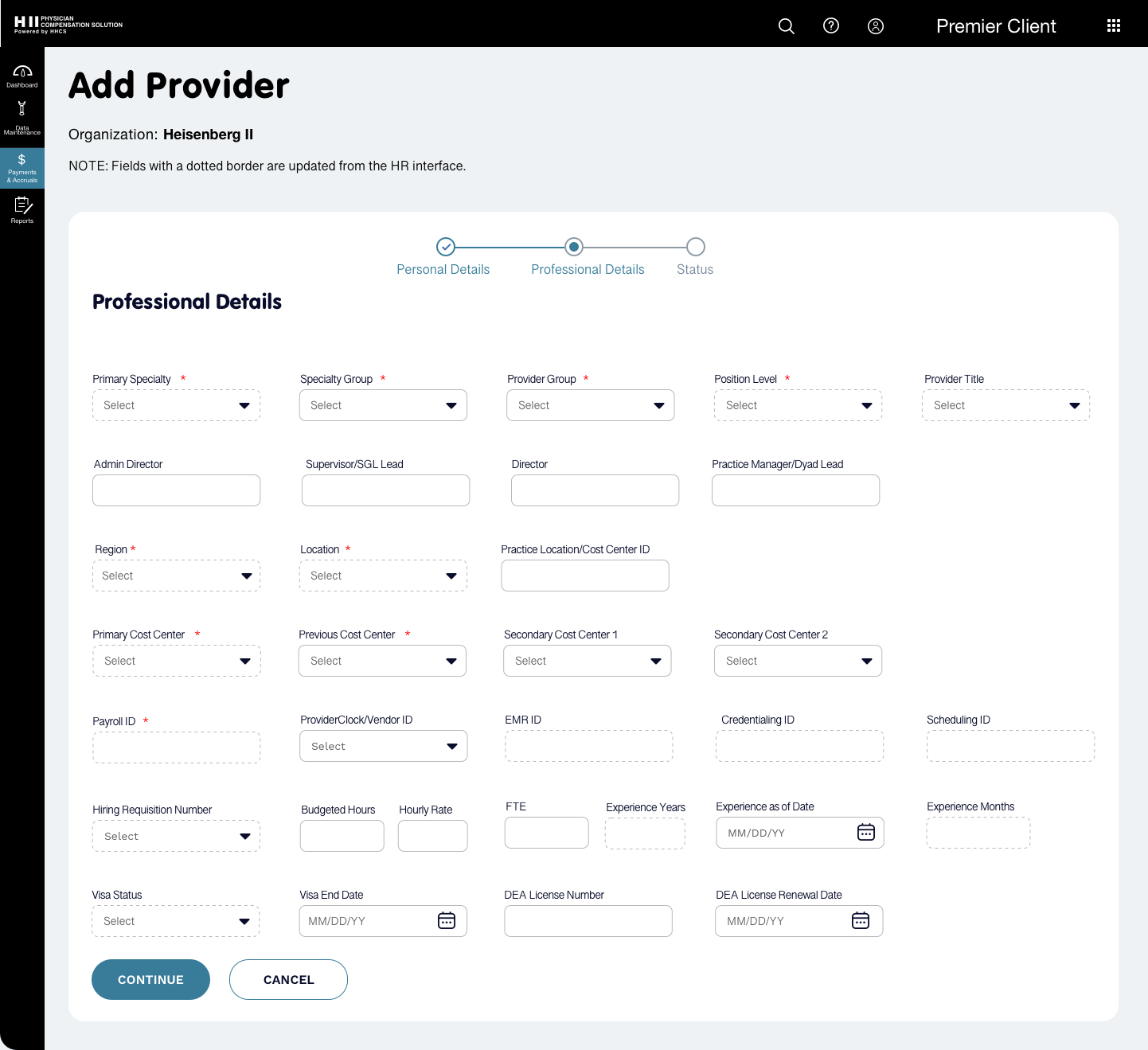
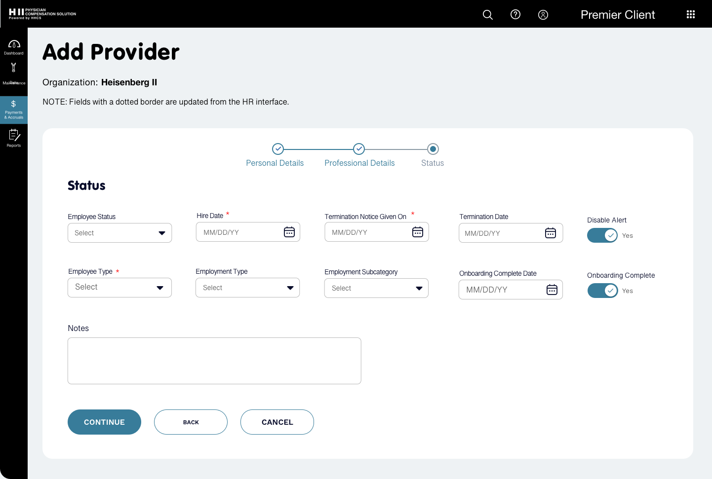
- Provider Setup is the term used for both Add Provider and Edit Provider and the same layout is used for both add and edit. It’s not clear to the user where they are and what action they are going to take.
- Field labels are far from fields making it hard for the eye to track and can lead to data being entered in the wrong field.
- There is no logical order to the fields. This requires more thinking on the part of the user and is tiring.
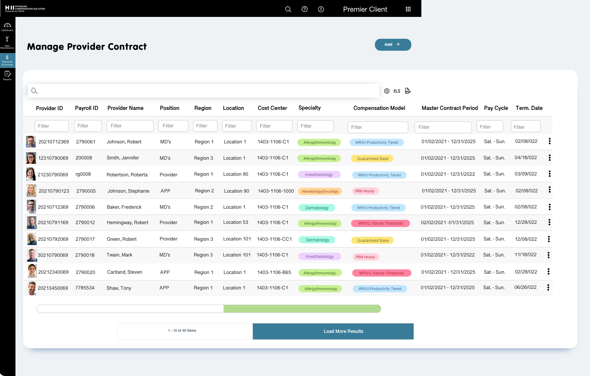
- The table rows are crowded and the bright blue of the edit link is hard on the eyes and distracting.
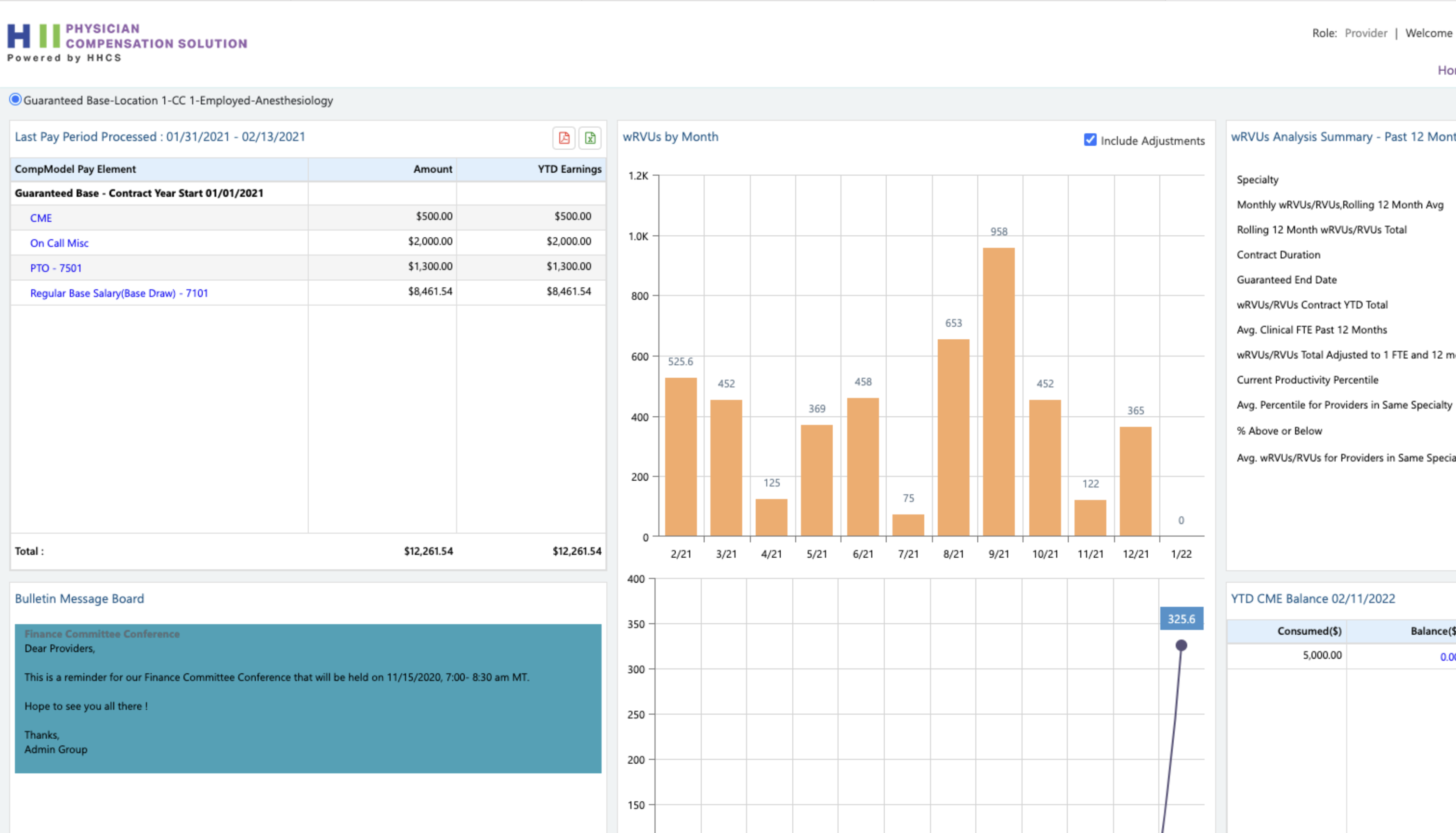
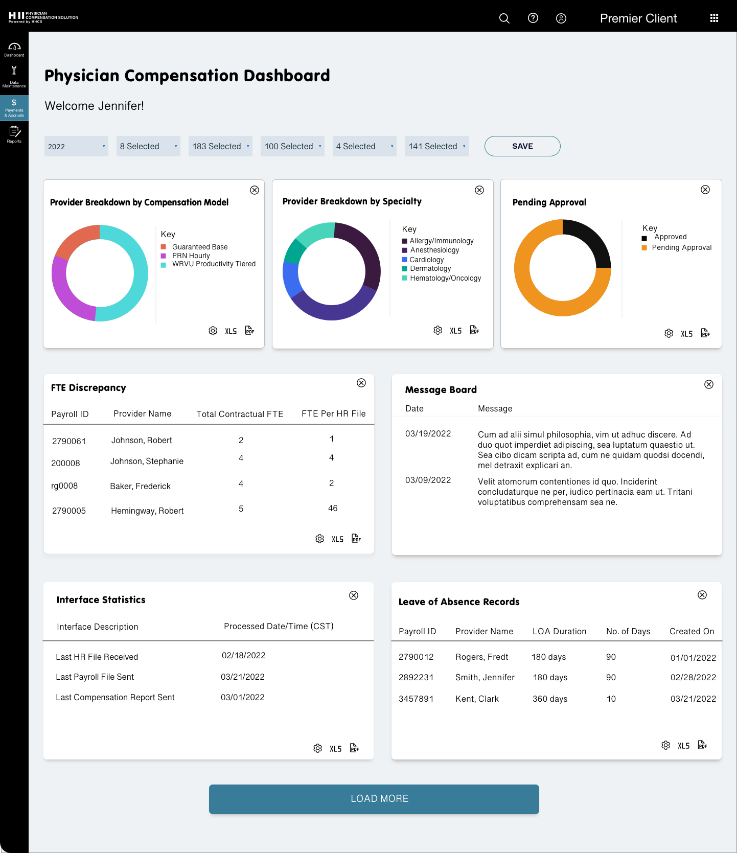
- The dashboard has a dated look and feel, there is little space between widgets, and its not clear what the chart data is referring to.
New layout
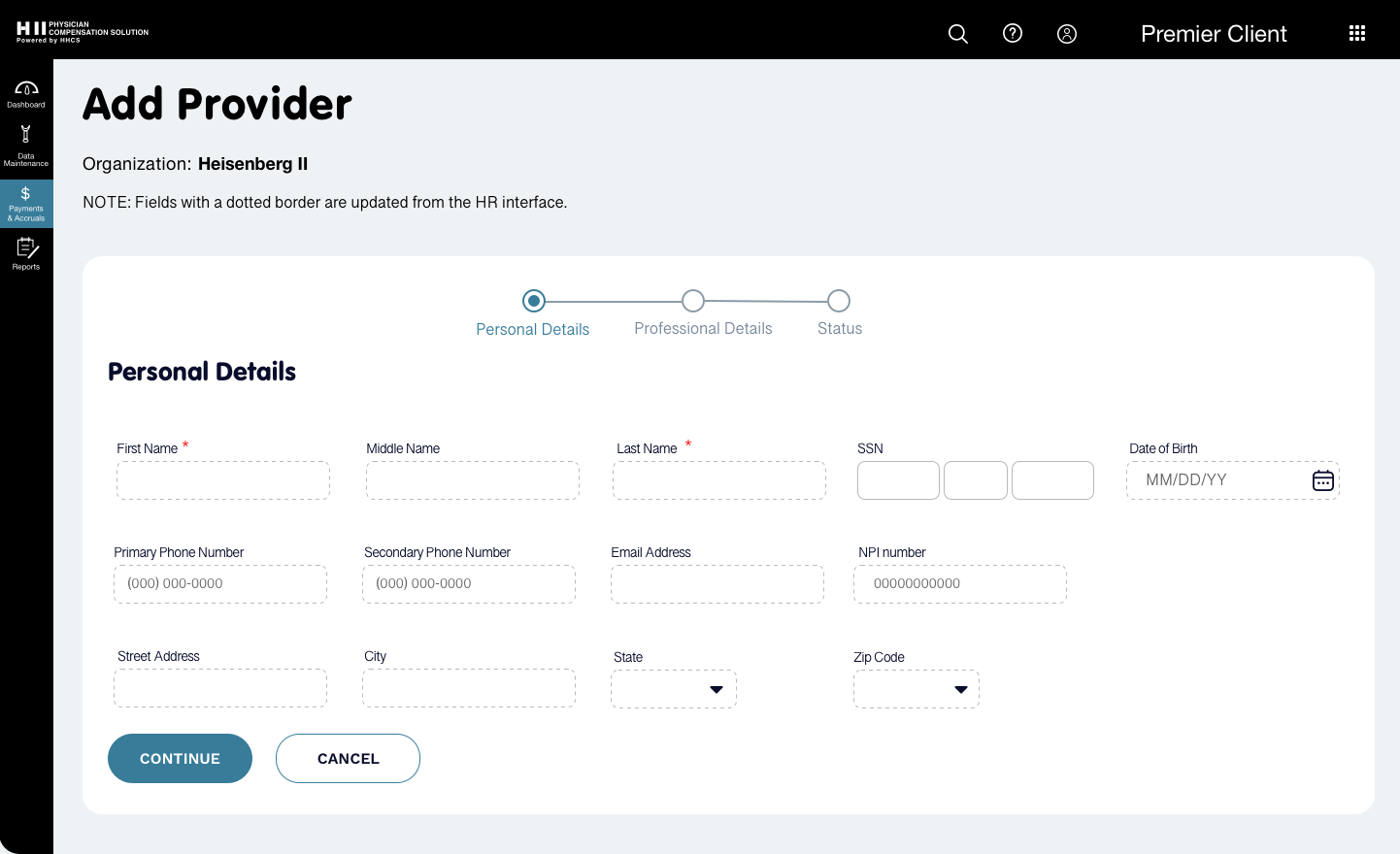
- Edit Provider and Add Provider have their own layout and nomenclature. The term Setup Provider is not used.
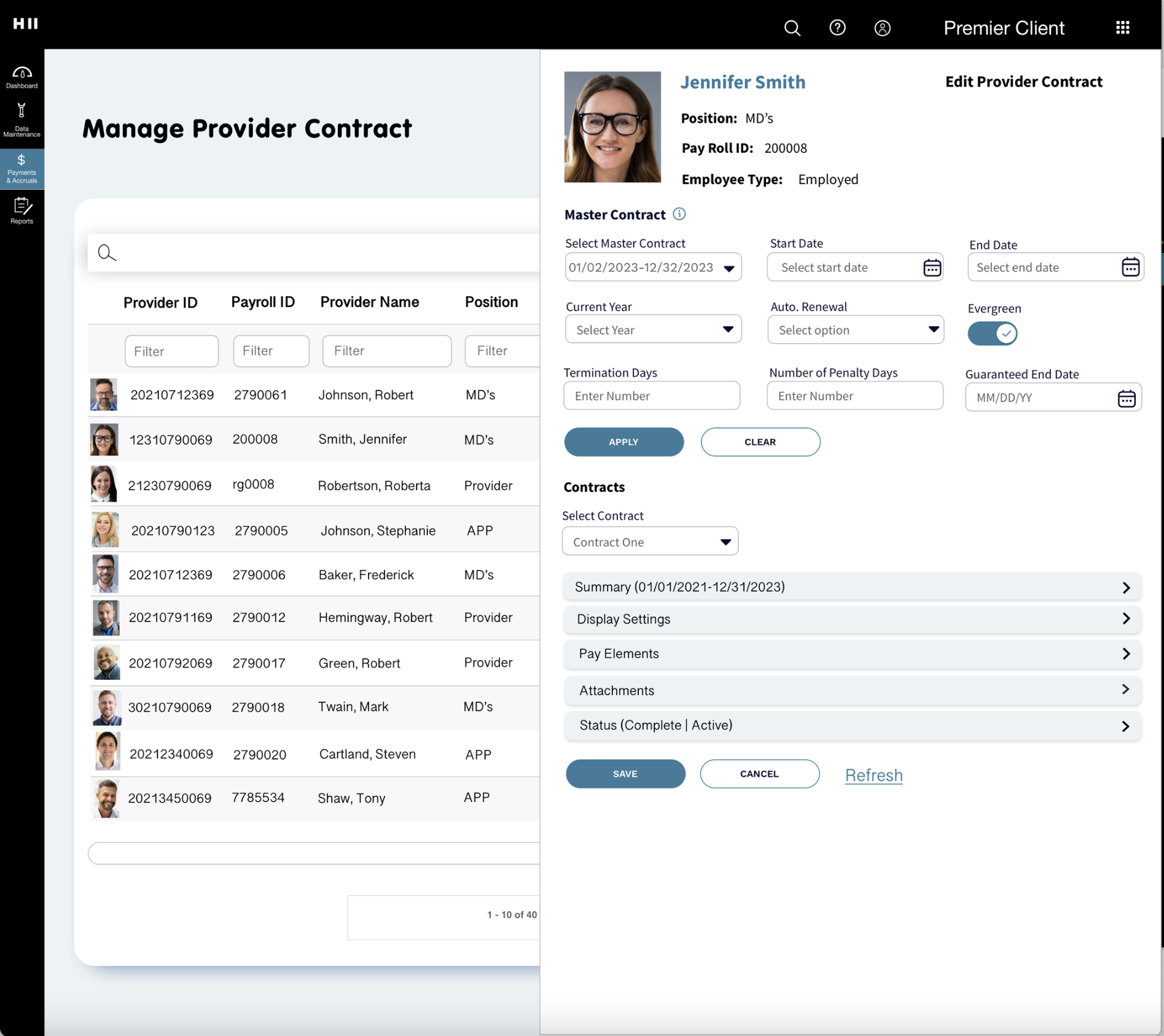
- An overflow menu in the table shows the edit function and when clicked, the Edit Provider screen slides out. This keeps the user from needing to go to another page. Clicking or swiping outside of the Edit Provider screen hides it.
- Edit Provider fields are grouped into sections and placed into accordians. This allows the user to edit the section of their choice without having to see the entire form.
- The table rows are higher making them easier to read. The use of colored tags and provider image provide visual interest.
- The charts in the dashboard have a key explaining what the data is. Hovering over a chart section brings up a tooltip with additional data and a link to do a deep dive on the data.
- Adding more space between dashboard widgets is easier on the eyes and makes each widget stand out.
