DUN & BRADSTREET
Product: D&B Credit Insights
My Role: Senior UX Designer on a product design triad
Here are designs from some of the larger features I created for Credit Insights.
I designed a landing page, along with marketing copy, for Credit Insights to introduce the new consumer grade vision. The design was presented to the VP of North American Product as well as the D&B CEO. They were excited and approved the design and product vision.
Note: At the time of this design, the product was called D&B Small Business Navigate.

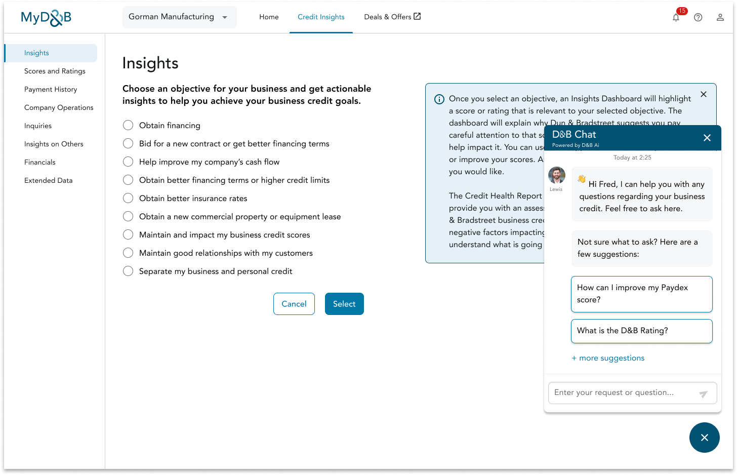
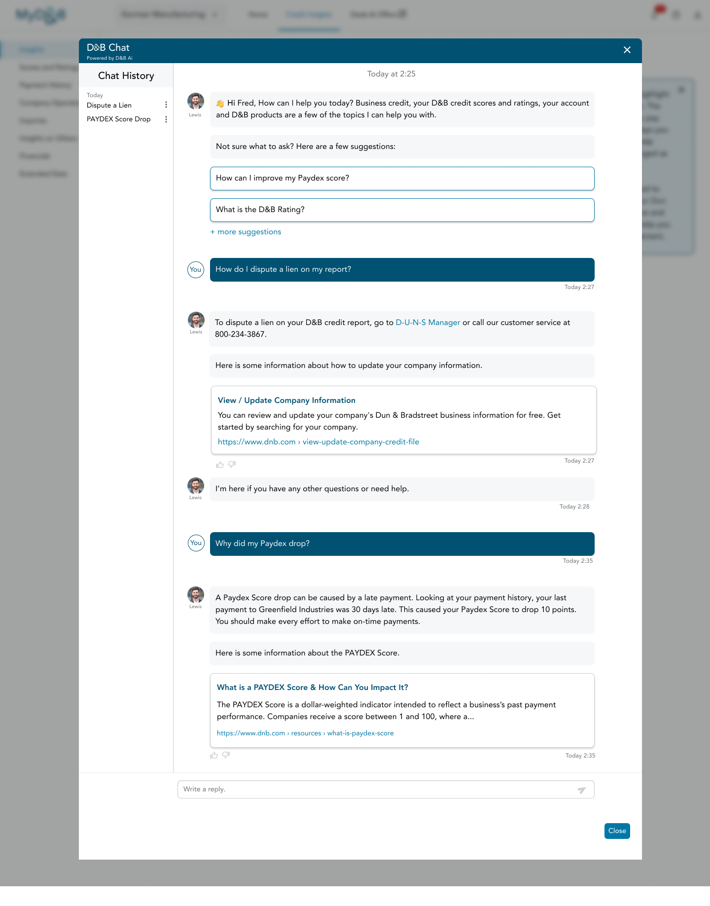
One of the feature redesigns allows user’s to select an objective for their business. They would then receive suggestions for how to achieve their objective. I felt this would be a great opportunity to have a chatbot that could provide more personalized advice. While we don’t have this capability yet, I wanted to show the benefit of having a chatbot.
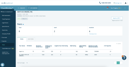
Here is a before and after. This is the redesigned Peers feature from Credit Builder, now known as Insights on Others. I created both the designs and copy for Insights on Others.
Problems with the Peers design:
- Unorganized content hierarchy
- Emphasizes number of Peers added instead of scores
- No context for what each score and rating means
- Lack of contrast for the Add Peers tab made it harder to see.
In the new design, the user initially sees a landing page with copy emphasizing the potential benefits of viewing and tracking a competitor’s scores and ratings. This is not something one would normally associate with competitor analysis so I felt it was important to explain.
Since this feature was only available on the highest tier I wanted to make sure we were communicating the value of the feature.
Page hierarchy is improved to put the emphasis on company search and how the competitor data can be used. As you’ll see below the amount of score and rating data provided is much greater than found in Peers.
